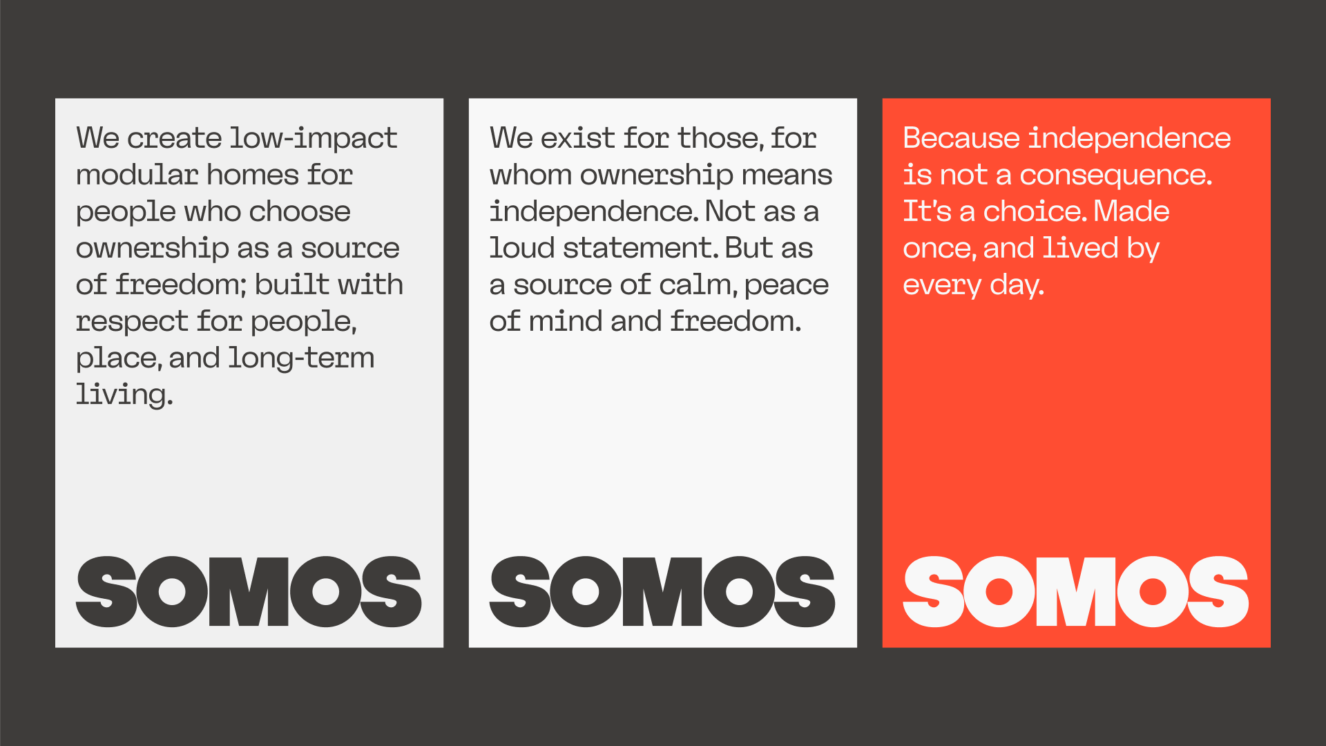
Owning a home should bring a sense of freedom and stability. Yet traditional homebuilding is often complex, slow and resource-intensive, turning ownership into a demanding process rather than a source of calm. SOMOS intends to rethink what a home (and the experience of creating one) could be for people looking for a simpler, more independent way of living.
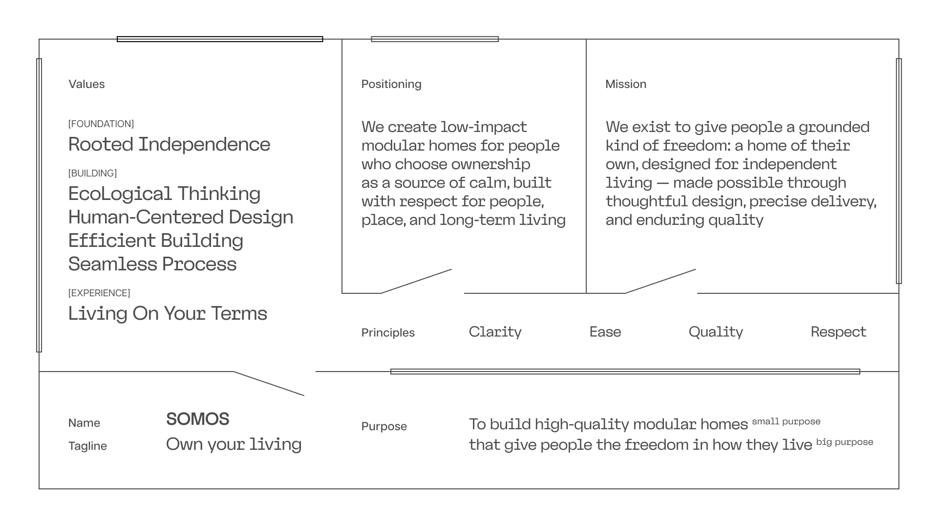
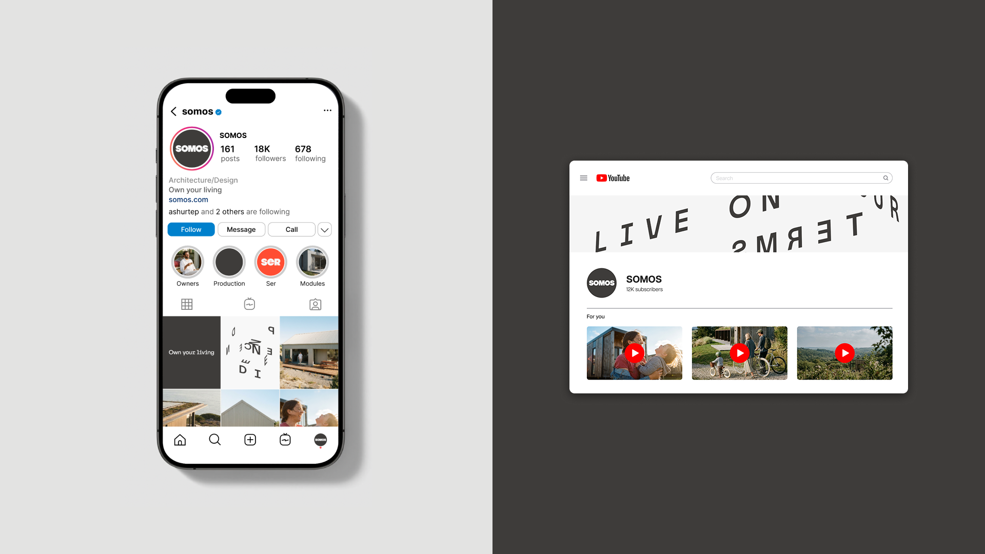
The strategy and visual identity was built around the idea of Rooted Independence, translating the modular logic of SOMOS homes into a clear and flexible design system. The name itself is a palindrome, adding another layer of meaning. Structured minimalistic layouts, a monospaced typeface reflect the precision, efficiency and clarity of modular construction. Combined with photography that places real home owners in the centre of SOMOS stories, they create a wide and flexible identity.
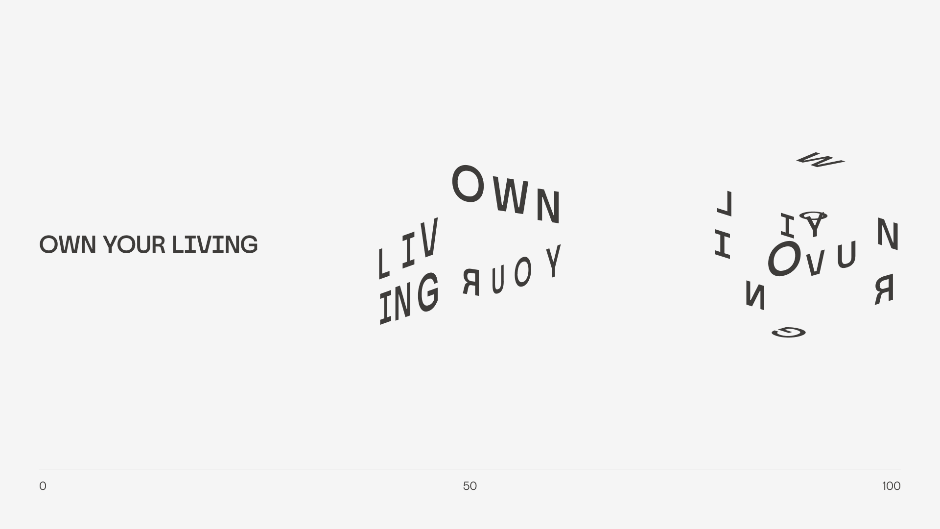
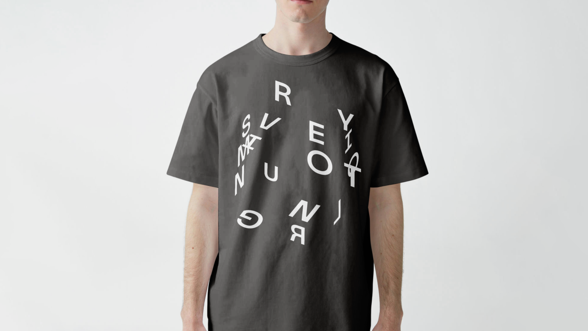
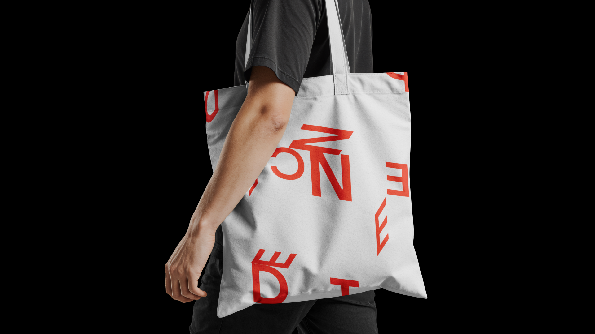
A dynamic typography tool TypeSpace was created specially for the project. The tool allows to wrap type around a cube and multiply the cube, creating unique typographic visual stories for each client.
Project done as a part of More, The Brand Design Executive Programme by Mucho
Authors
Strategy and Brand Design: Hanna Piatrusha
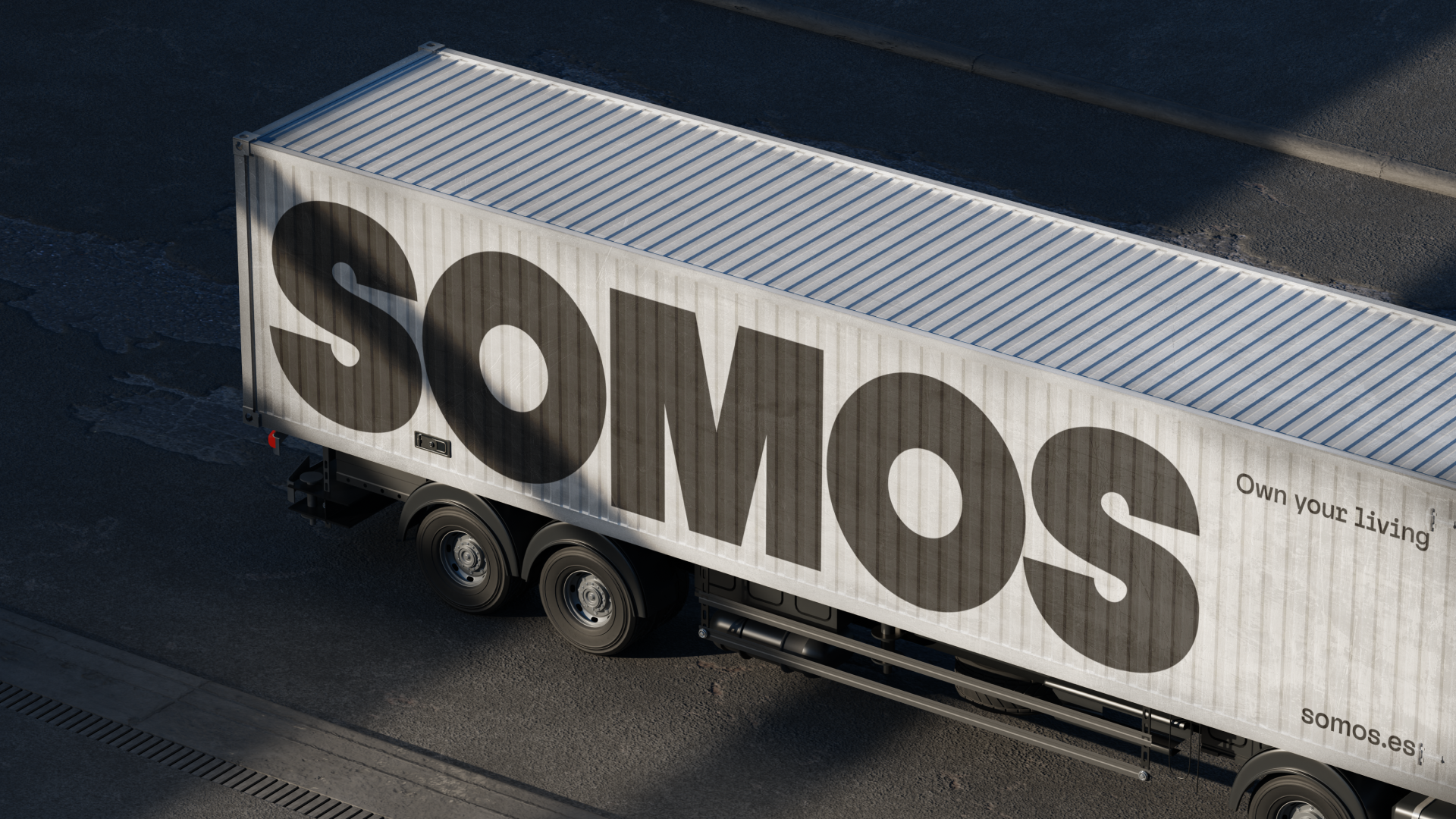
The intensity of typography extends from readable to semi-readable to abstract
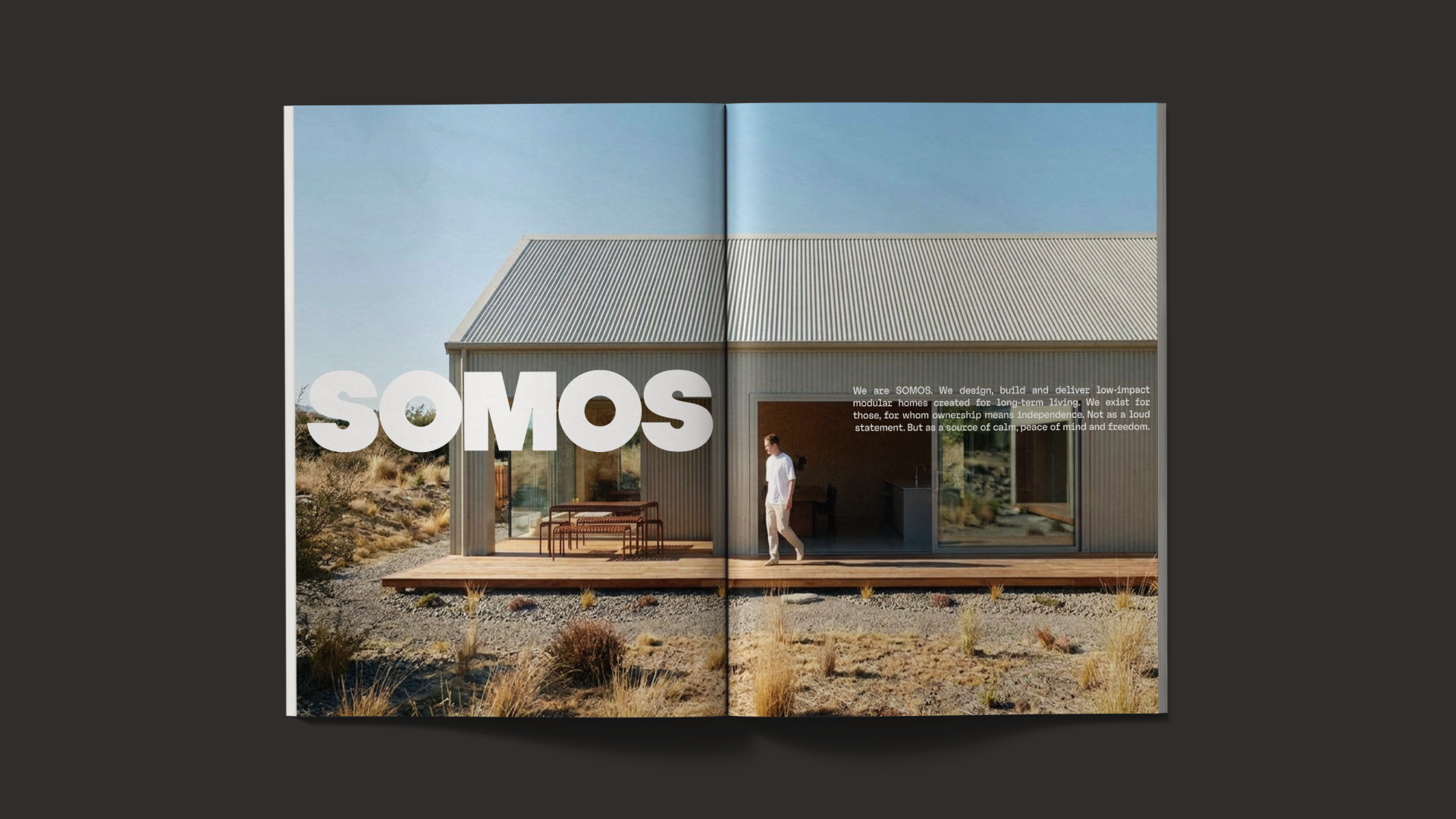
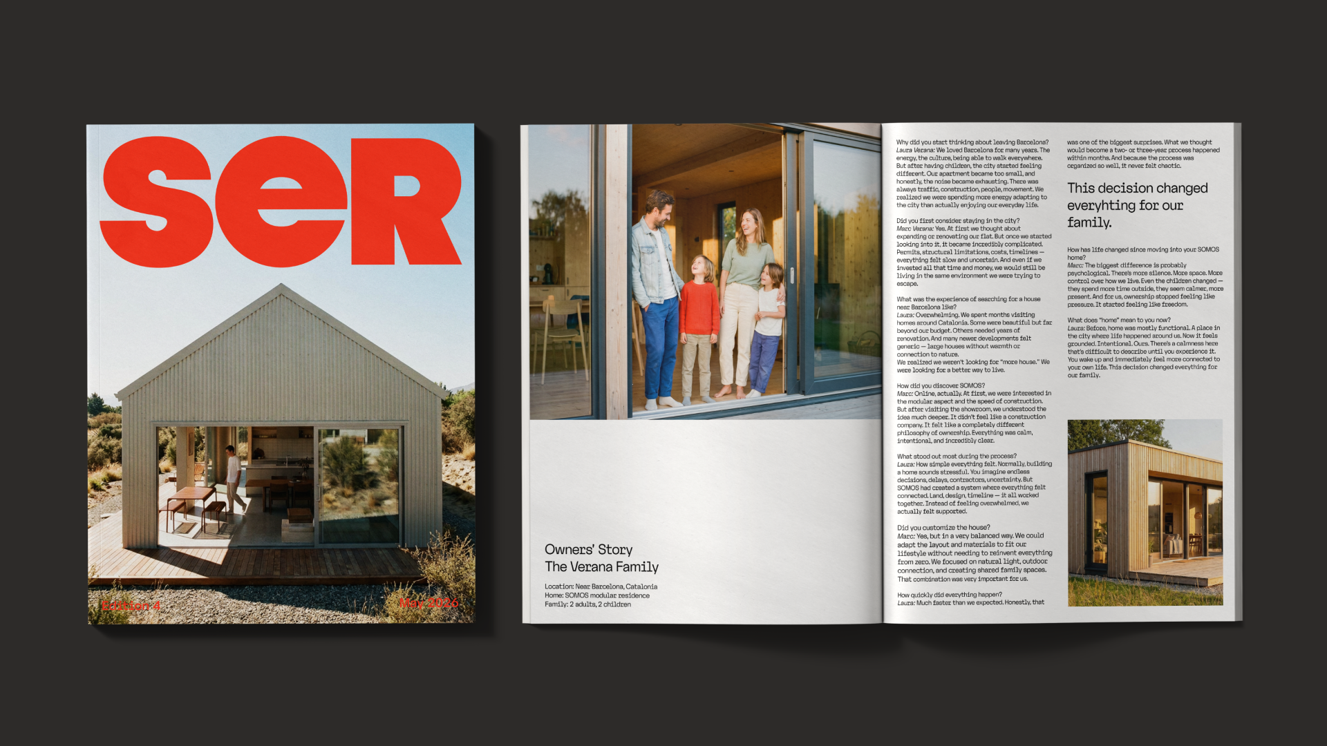
Lifestyle magazine SER, with case studies from home owners, interviews with industry leaders and tips from designers, architects and people who choose to live on their terms
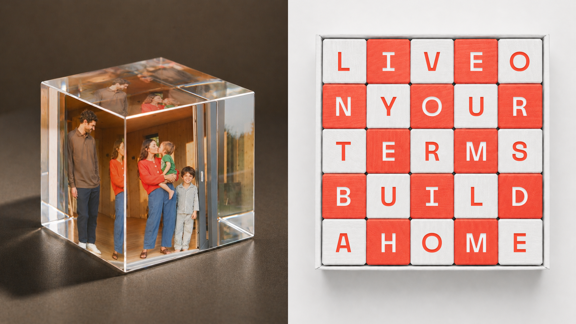
As a part of the customer journey, the clients receive a welcome gift on the move-in day: a transparent cube with a special object, like a photograph or a stone from the place. The little ones receive a wooden cube set