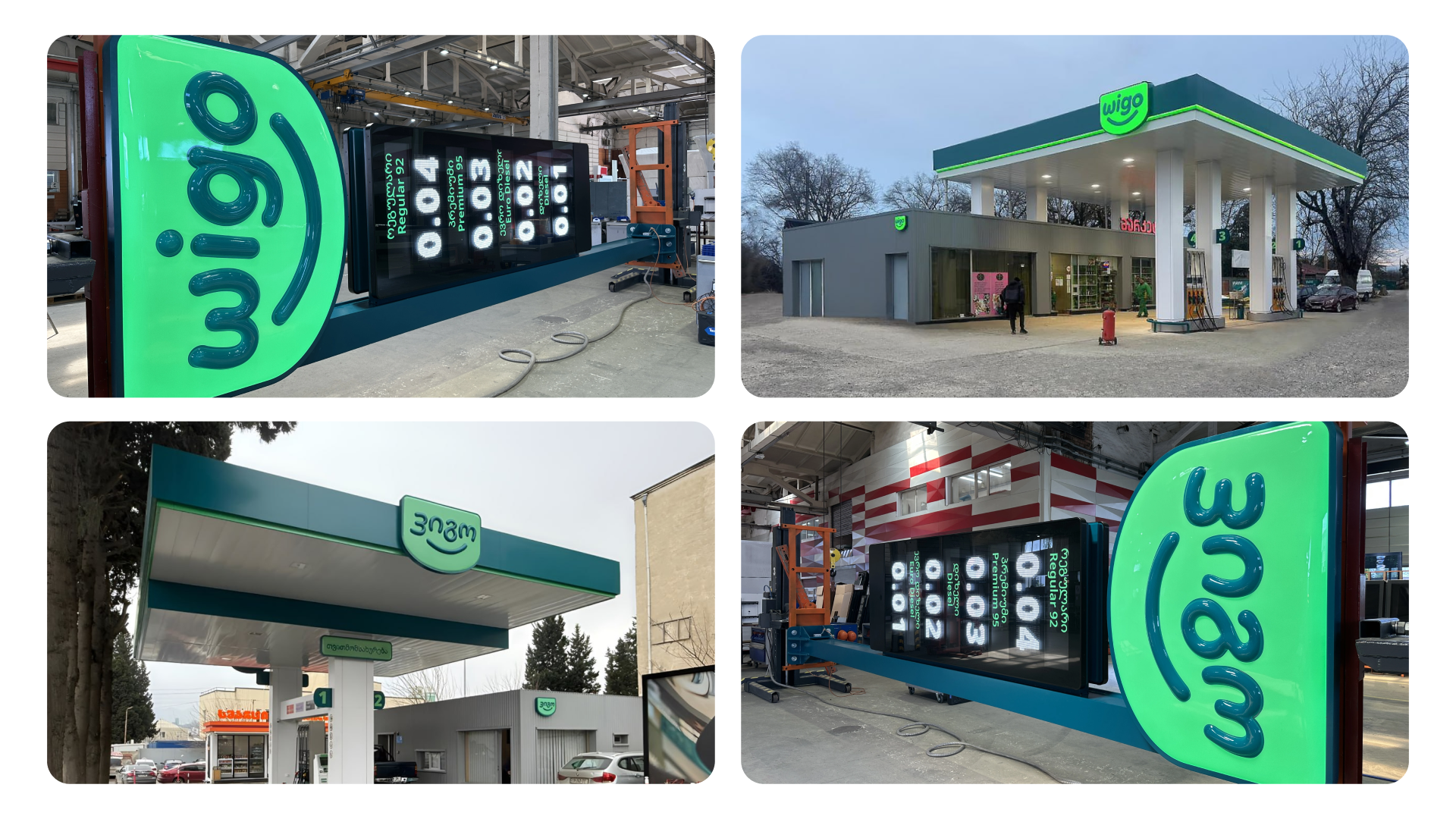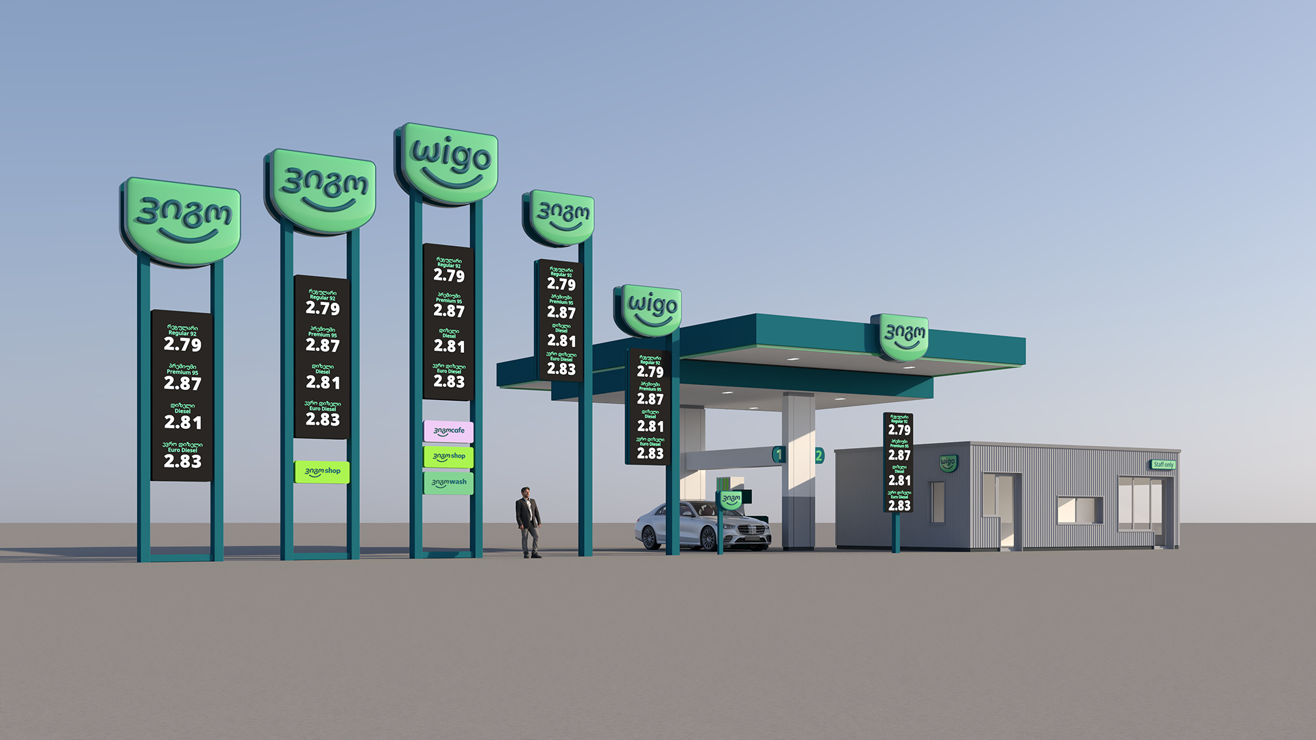
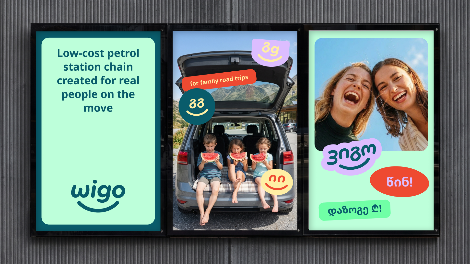
Wigo is a new low-cost petrol station chain in Georgia, under the Wissol brand. In a competitive market, the task was to differentiate Wigo not only through price, but also through a distinctive emotional connection and modern brand identity that resonates with a younger, dynamic audience.
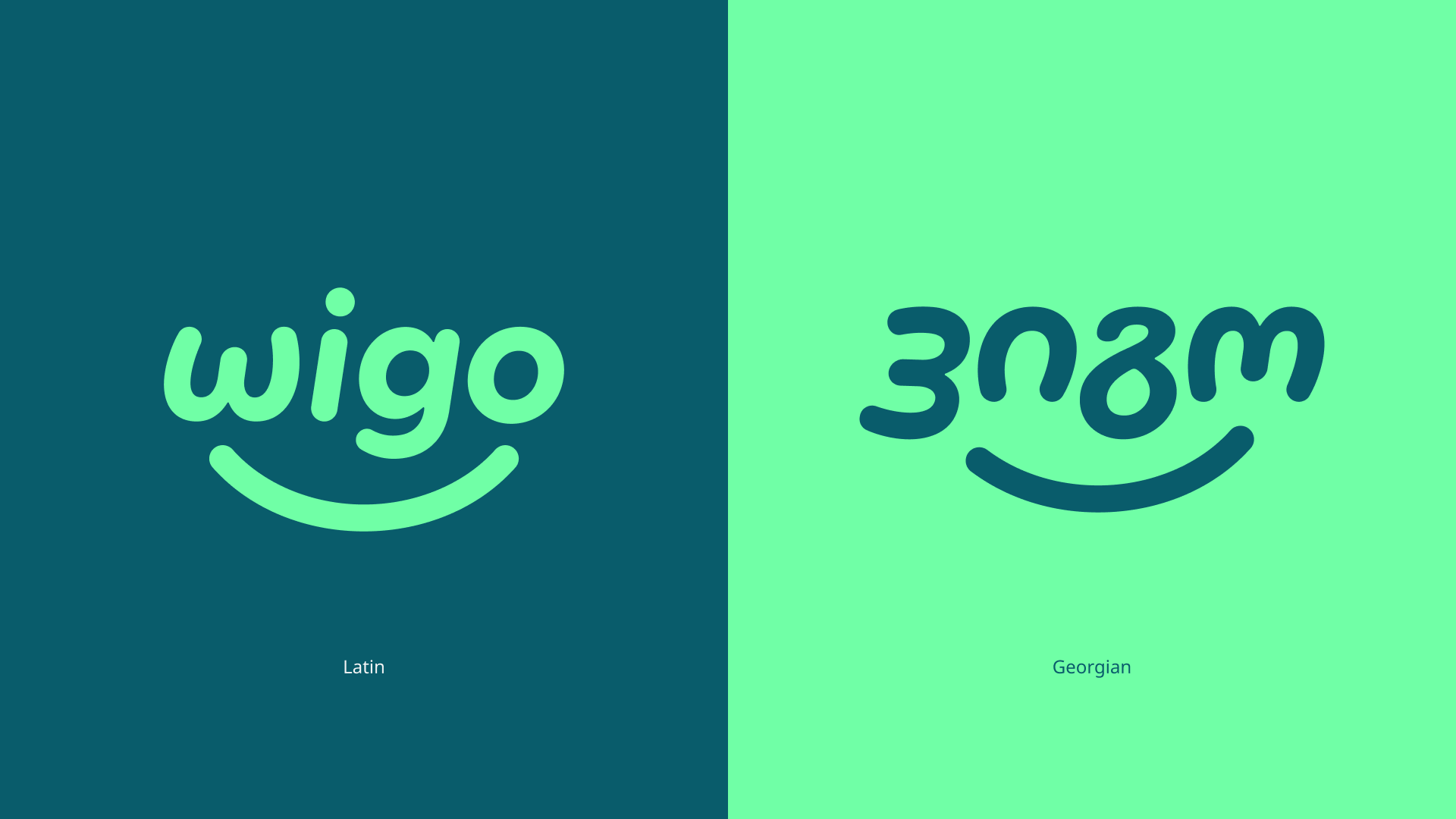
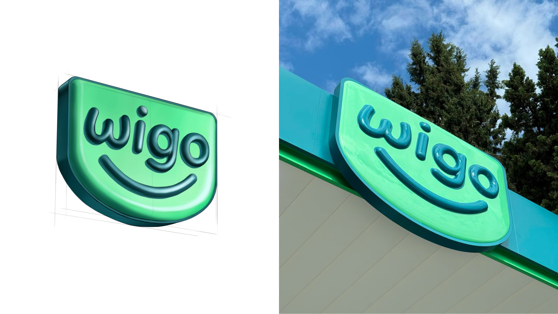
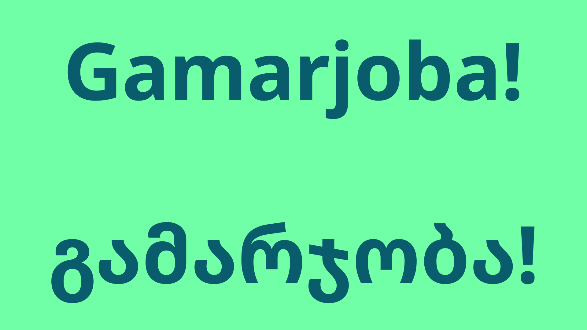
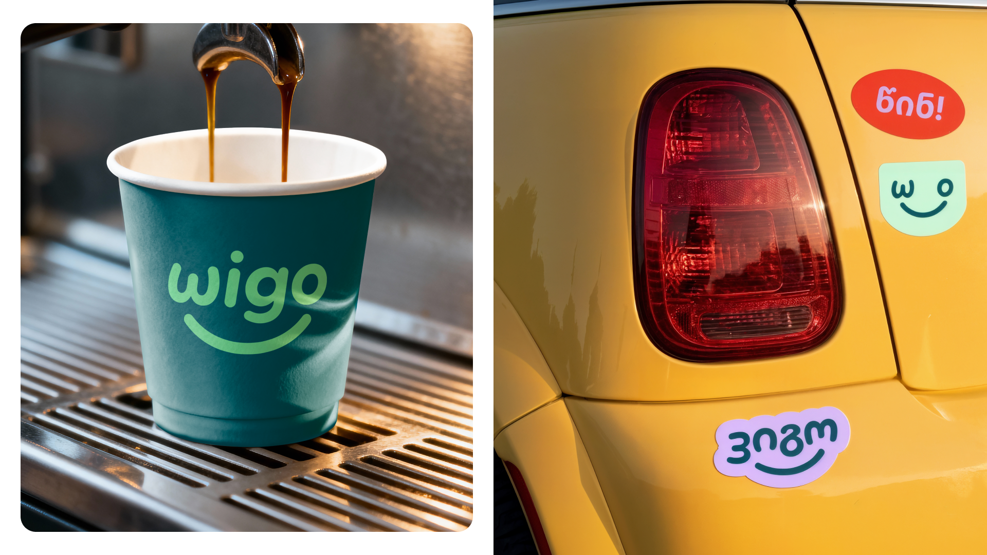
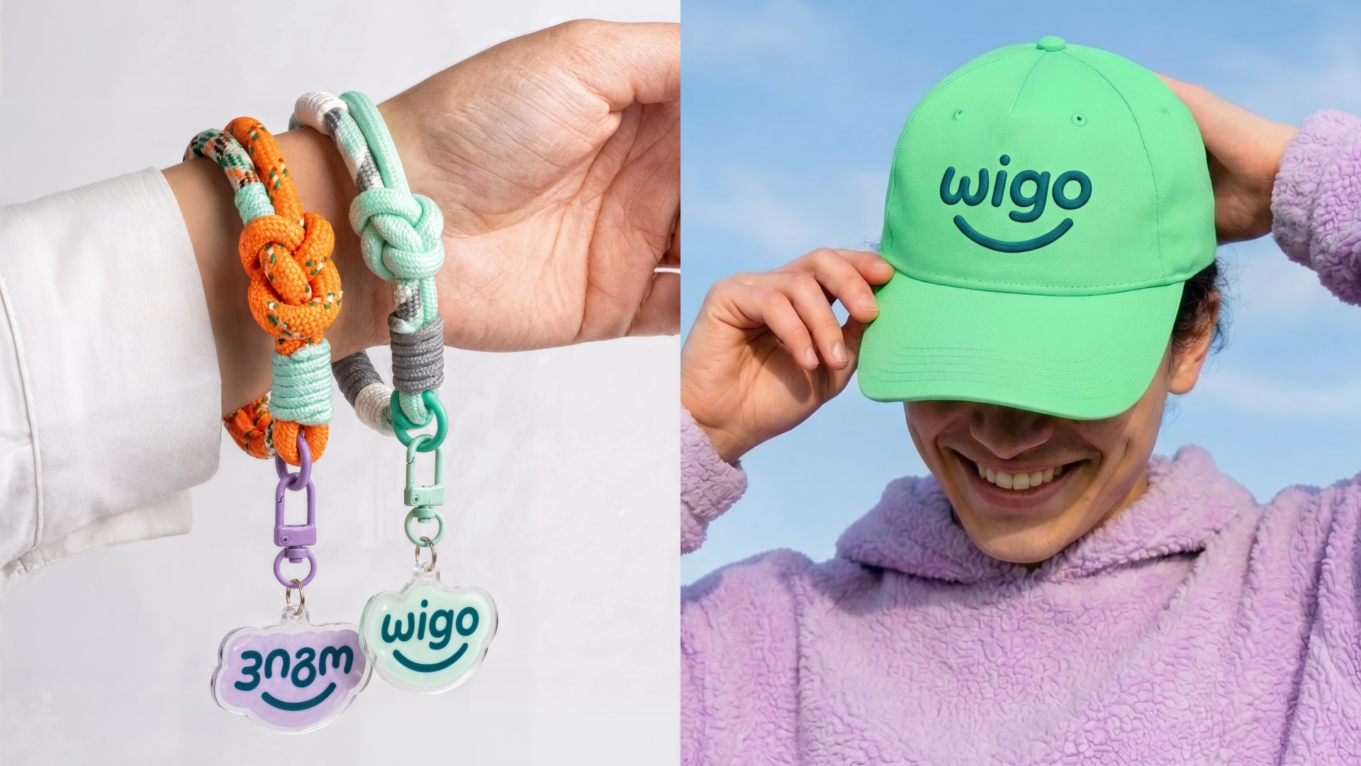
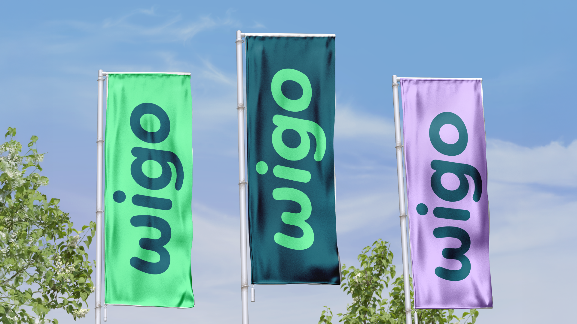
In order to achieve the aim, a smile was implemented in the logo. Letters in the logo are based on the Georgian letterforms. The design direction reflects the idea of optimism and accessibility, visually emphasising Wigo as a modern, positive stop for everyday journeys. The use of bright and engaging visuals helps create a recognisable and memorable brand presence both on the road and in digital environments.
Client
Wissol
Authors
Art Direction: Elizaveta Artyuhoovich
Graphic Design: Hanna Piatrusha
Production and Instalment: vds.group
Result
8 place out of 250 at Tashkent Design Week
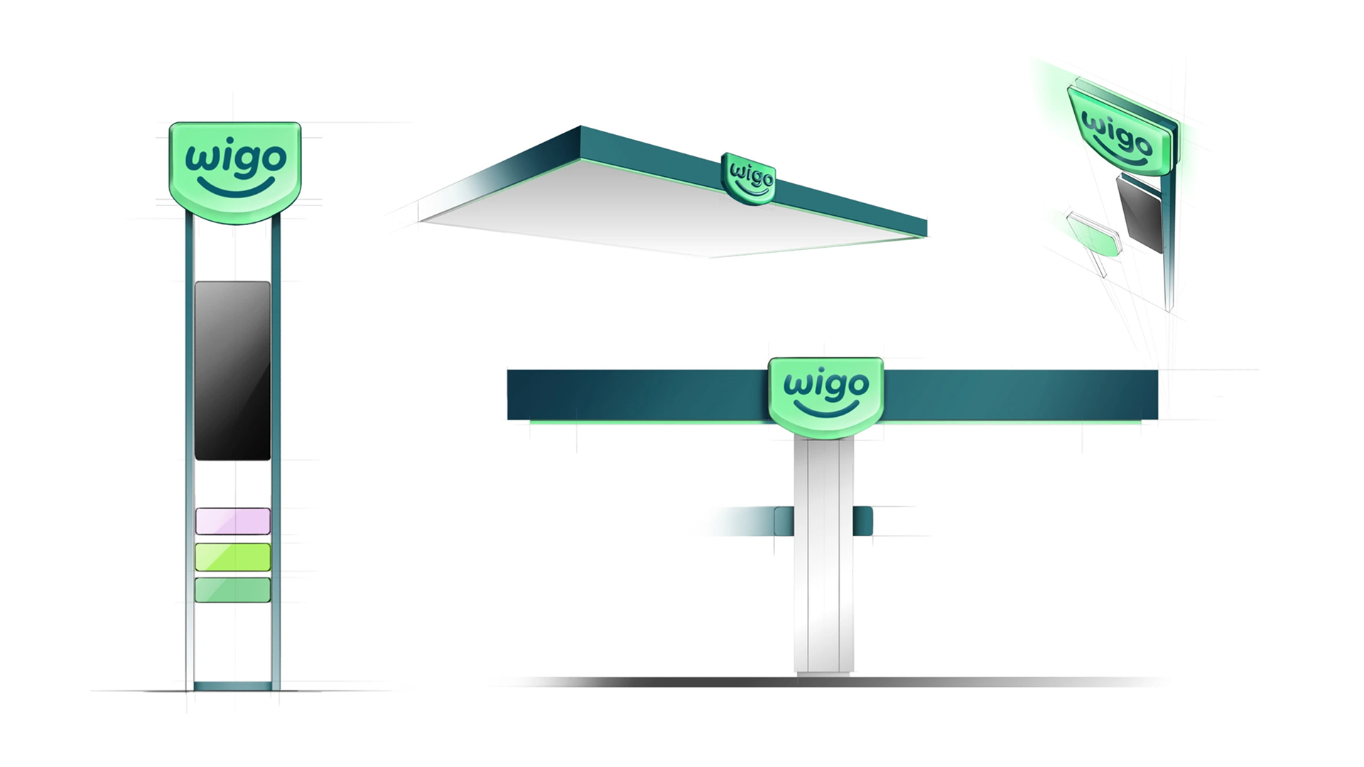

At the moment, Wigo stations are being produced and installed all over Georgia.