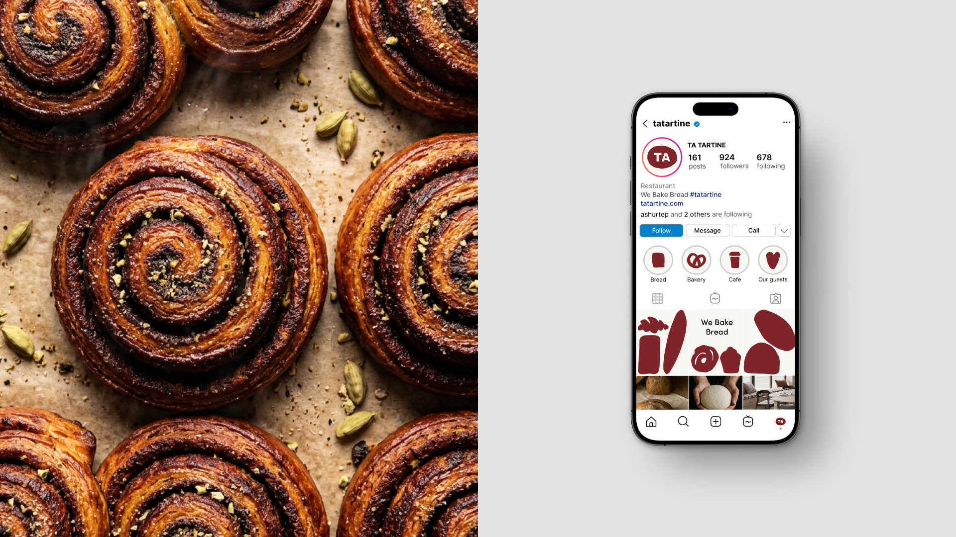
Ta Tartine is a bakery based in Tatarstan. The name was carefully chosen to carry a double meaning: tartine refers to a type of bread, while ta tartine in French — inspired by the founders’ love for French baking — means your toast. Read together, it also echoes TATARtin, subtly referencing the bakery’s roots in Tatarstan.
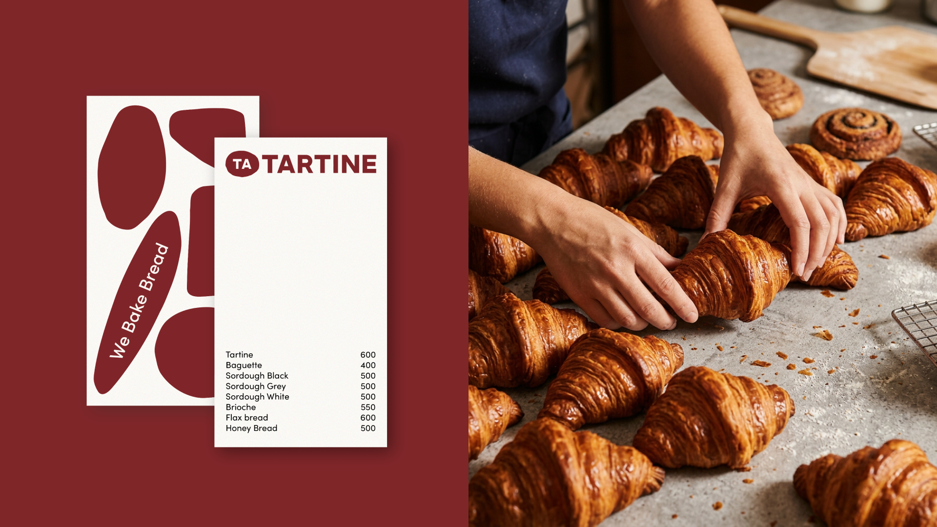
The visual identity needed to capture the spirit of artisanal craftsmanship. The founders are deeply passionate about the technical side of breadmaking, skillfully blending traditional knowledge with modern technology. Yet, no matter how precise the process, the outcome is never fully predictable — and it’s this beautiful imperfection that we wanted to bring into the brand.
The solution
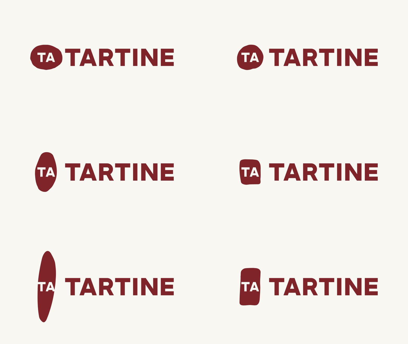
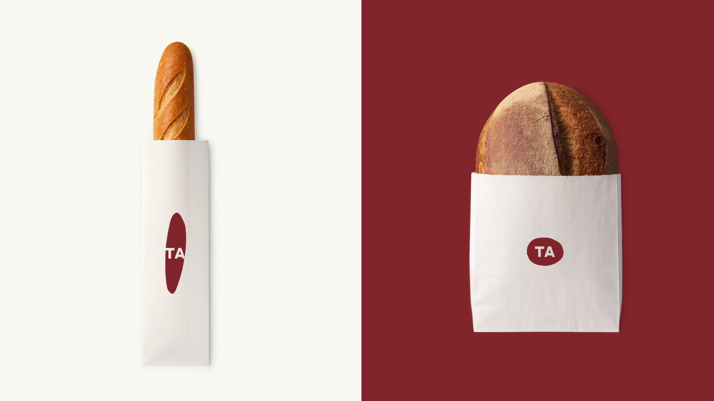
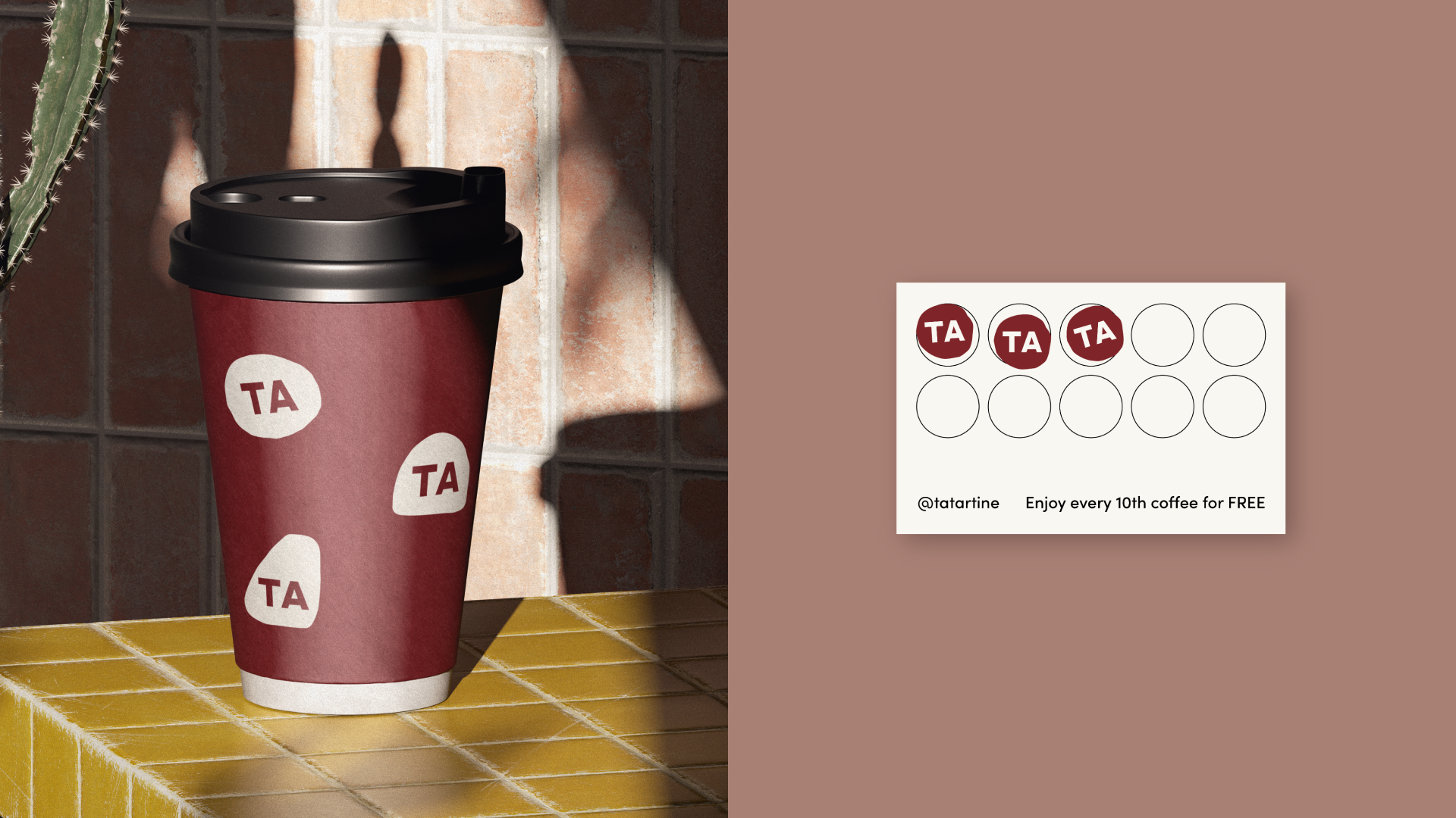
The image of an actual tartine was integrated into the logo and paired with the short, simple ta, so the idea of your bread remains at the heart of every touchpoint. Taken further, a system of logos was created, all drawn by hand and depicting different kinds of bread and pastry, emphasising authenticity and individuality.
Client
TA TARTINE
Year
2023
Authors
Art Direction and Naming: Elizaveta Artyuhovich
Graphic Design: Hanna Piatrusha