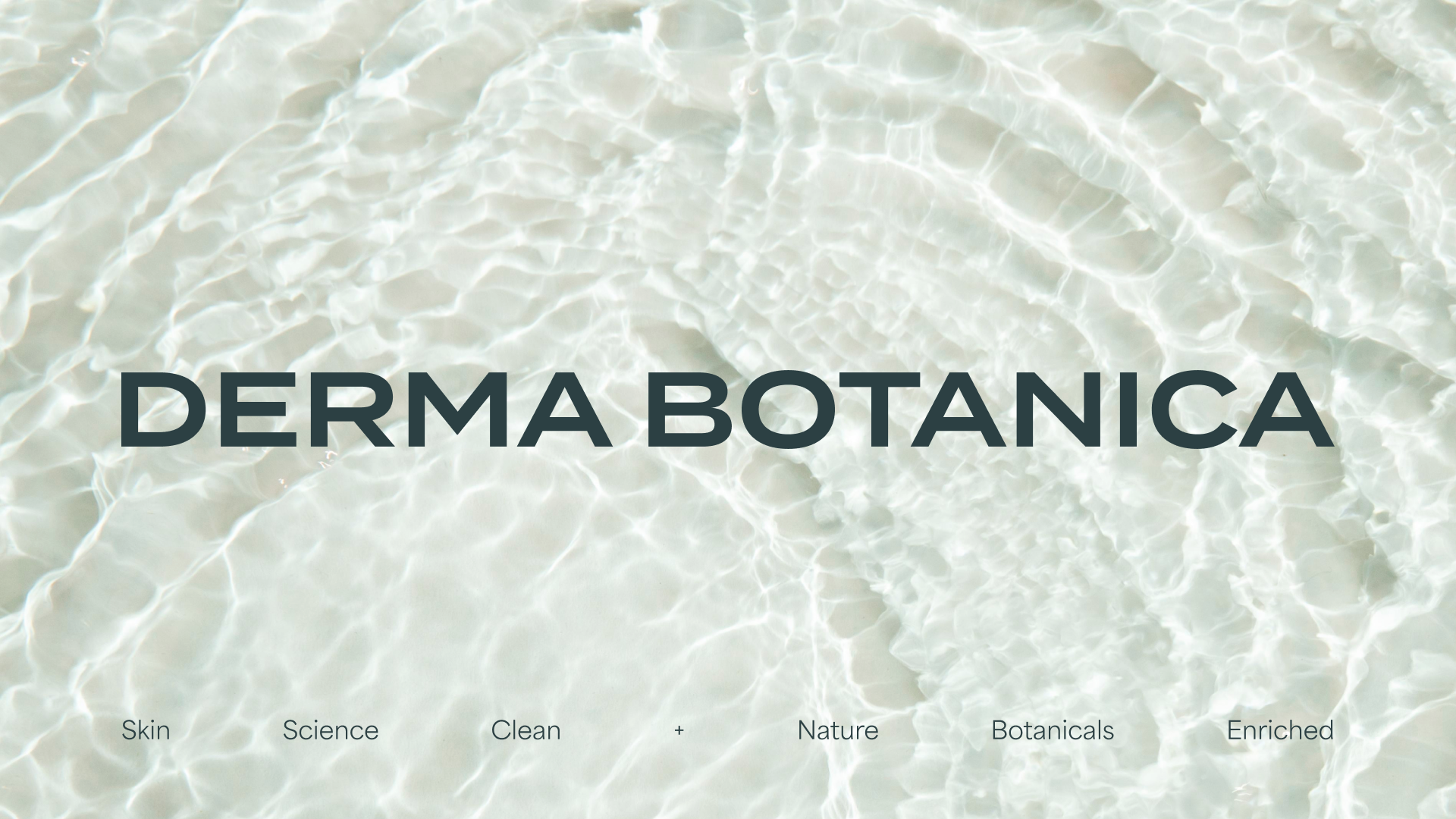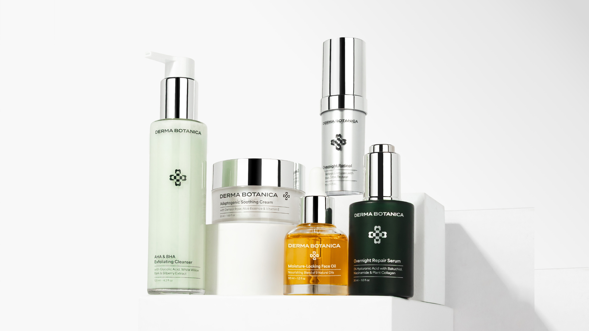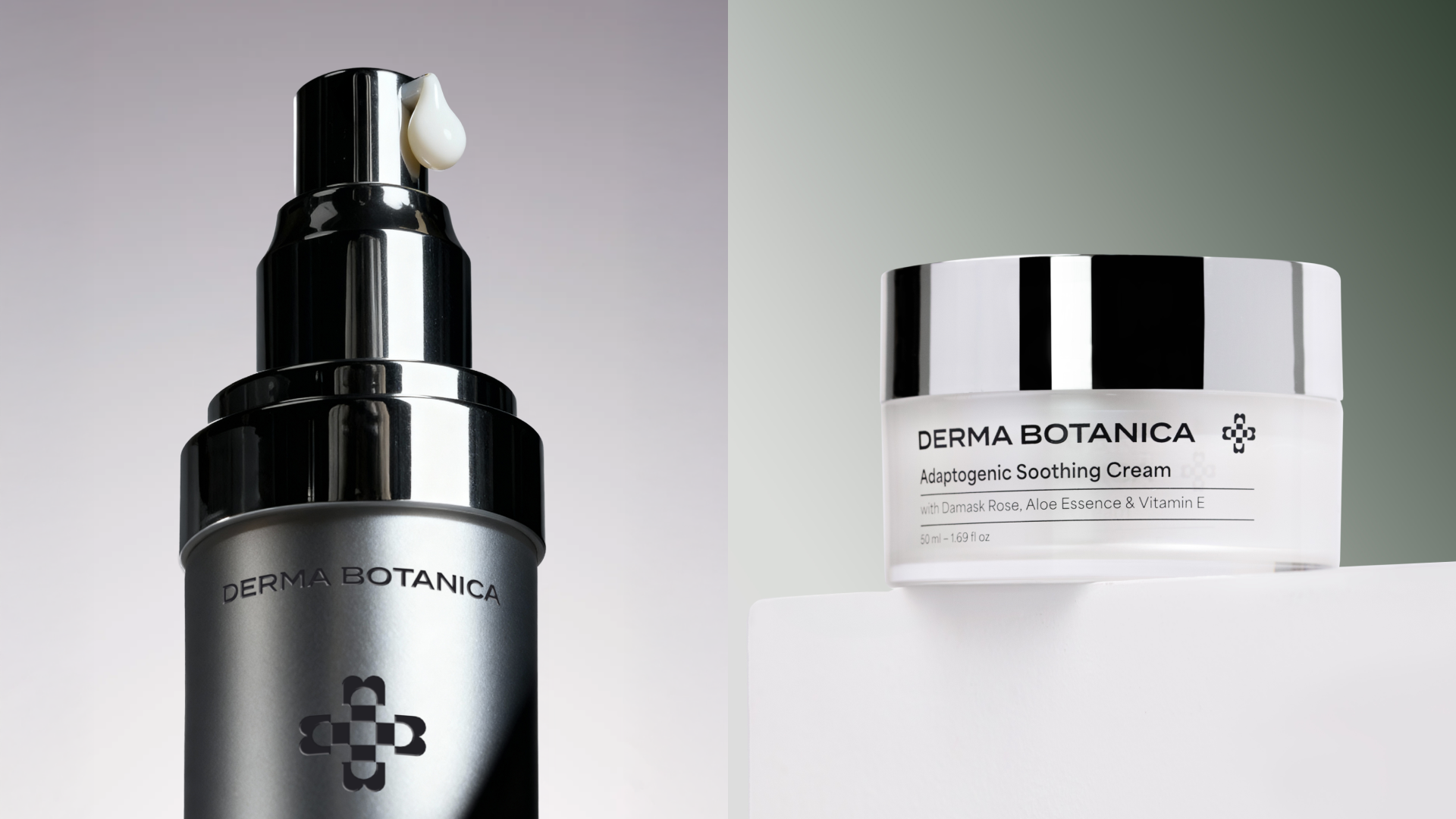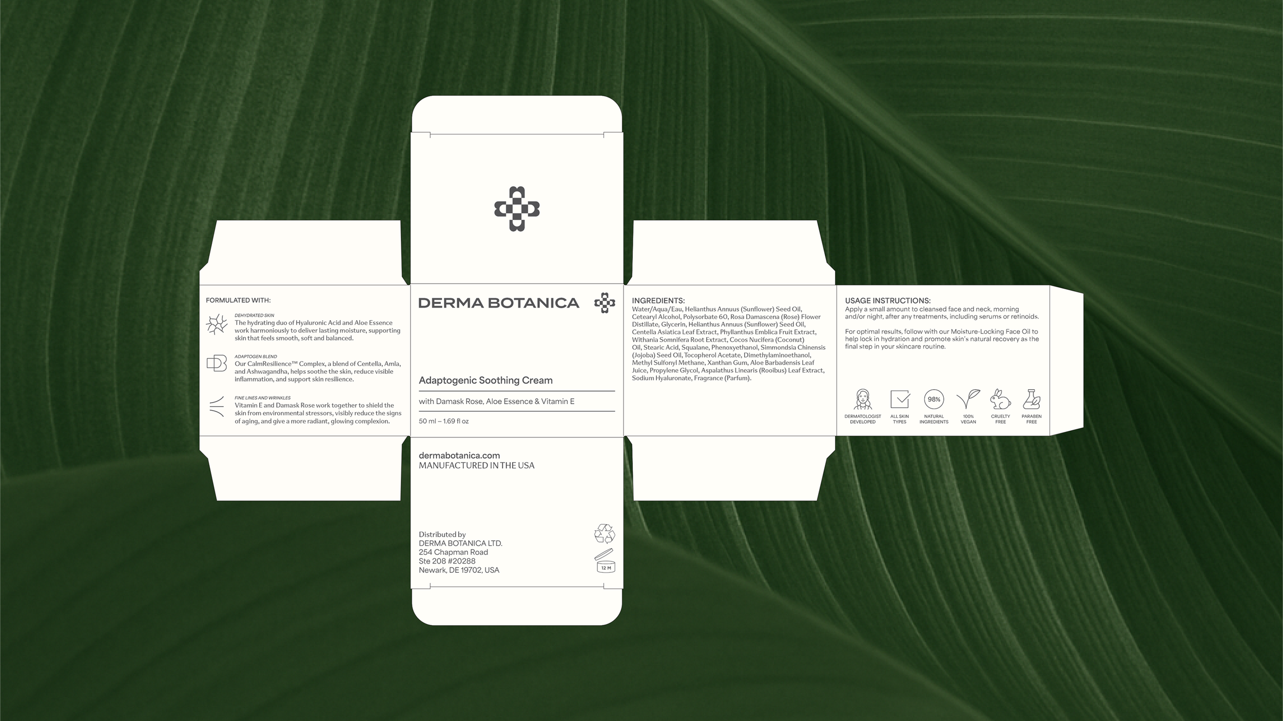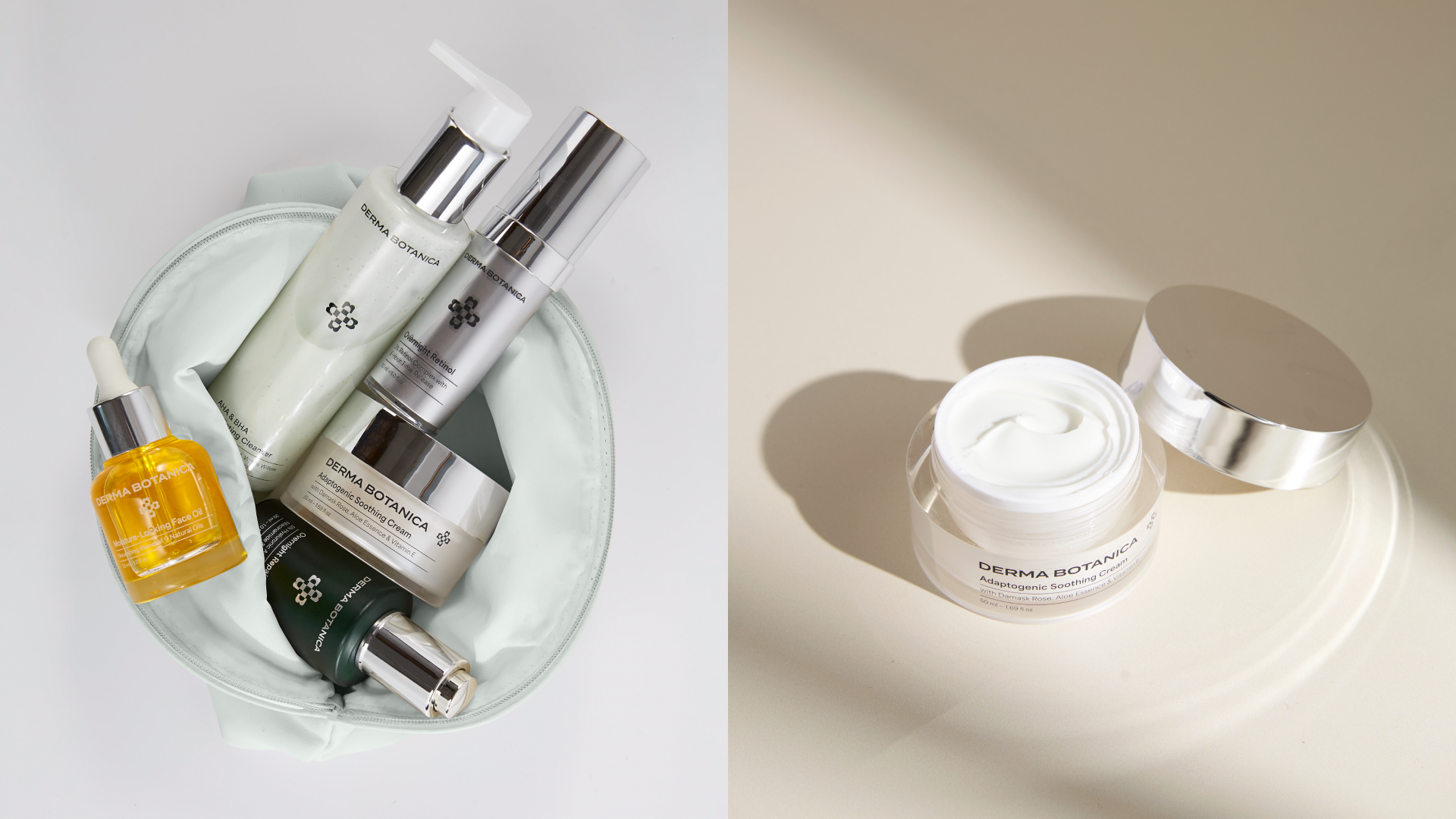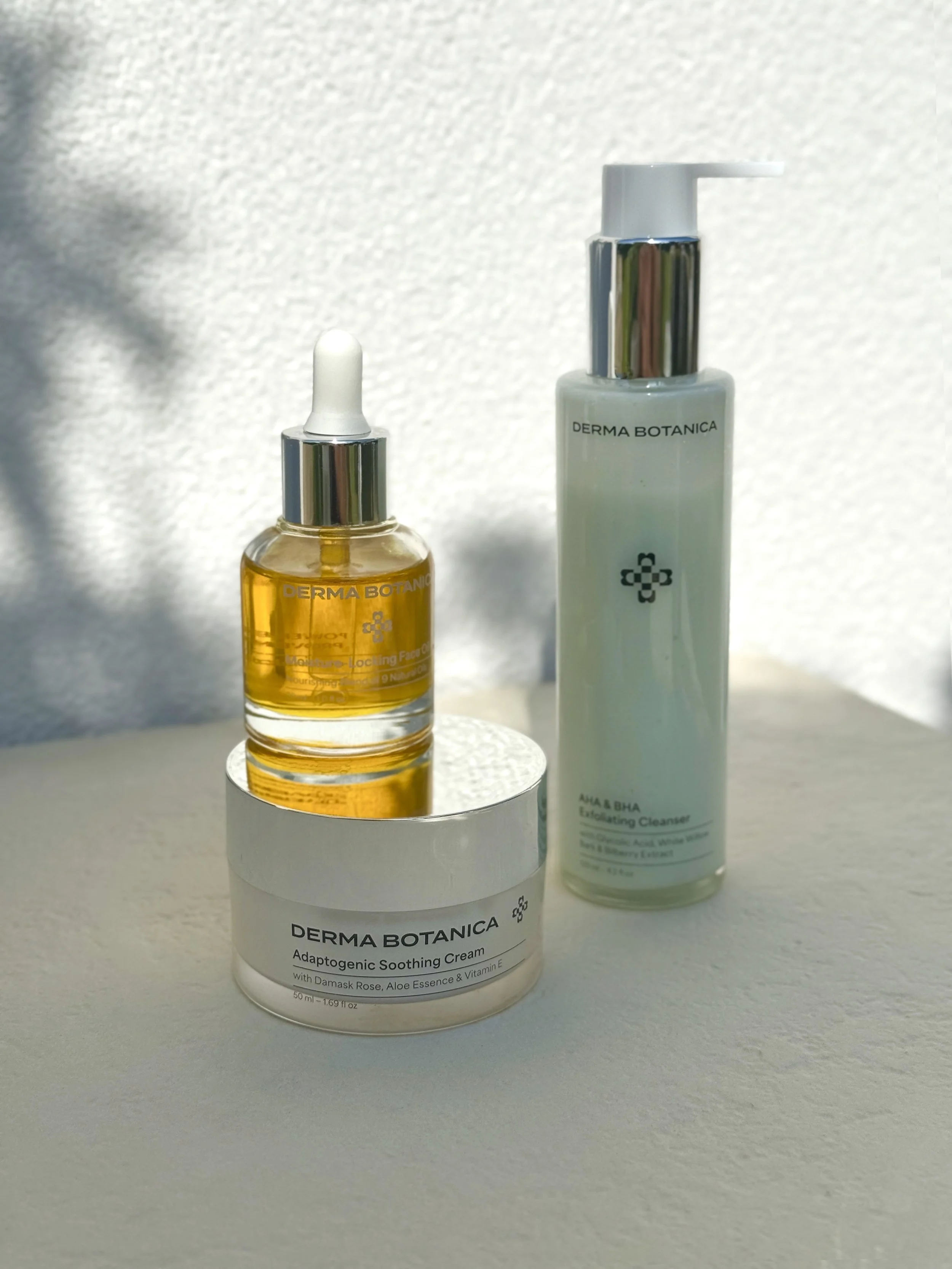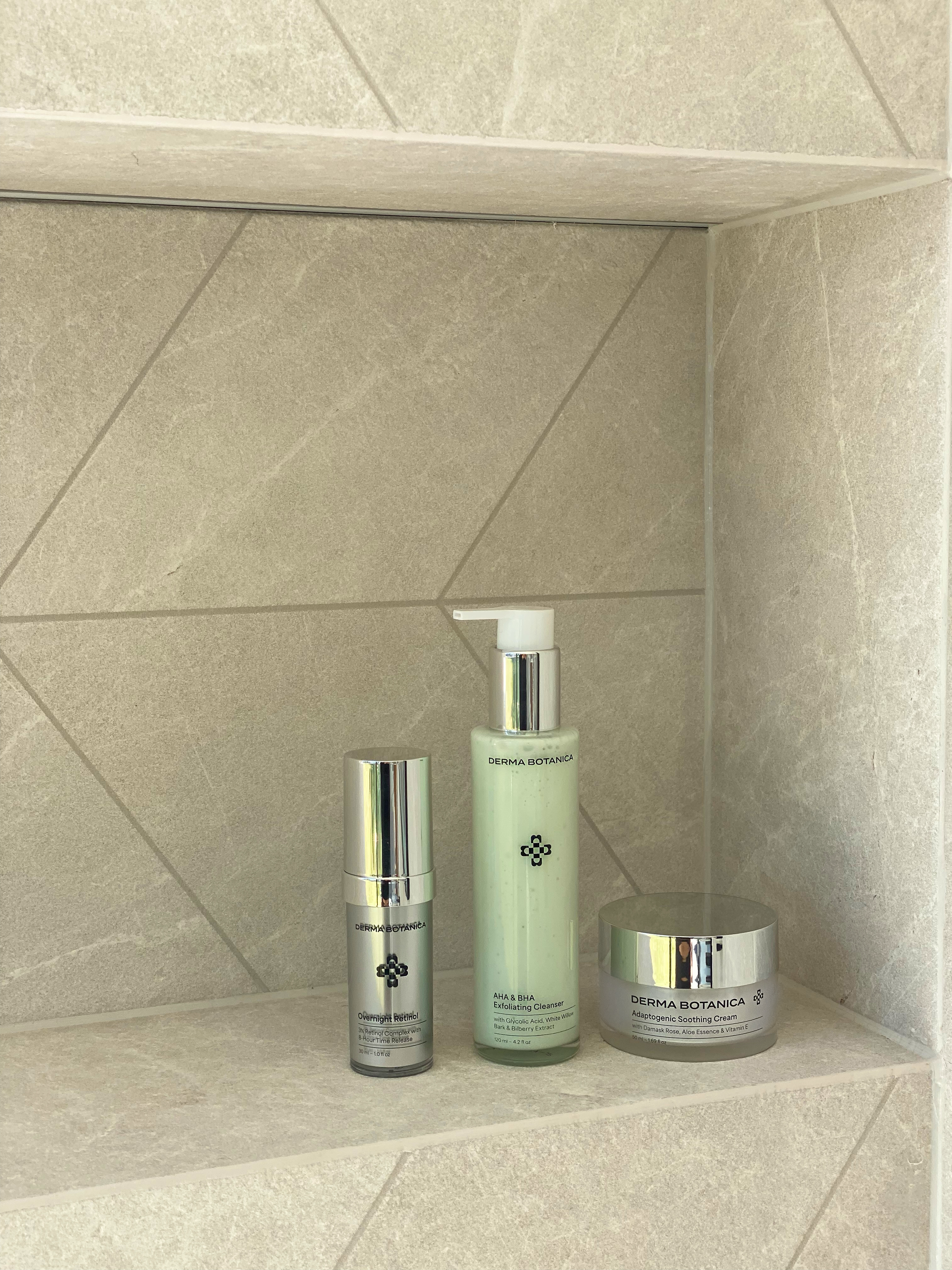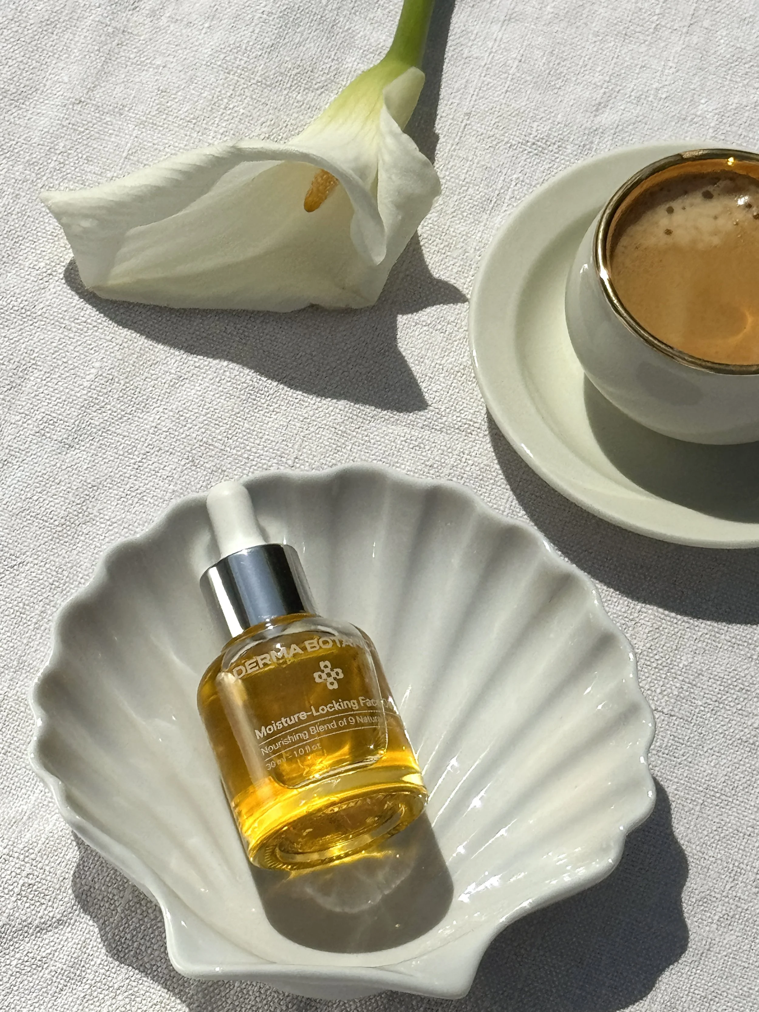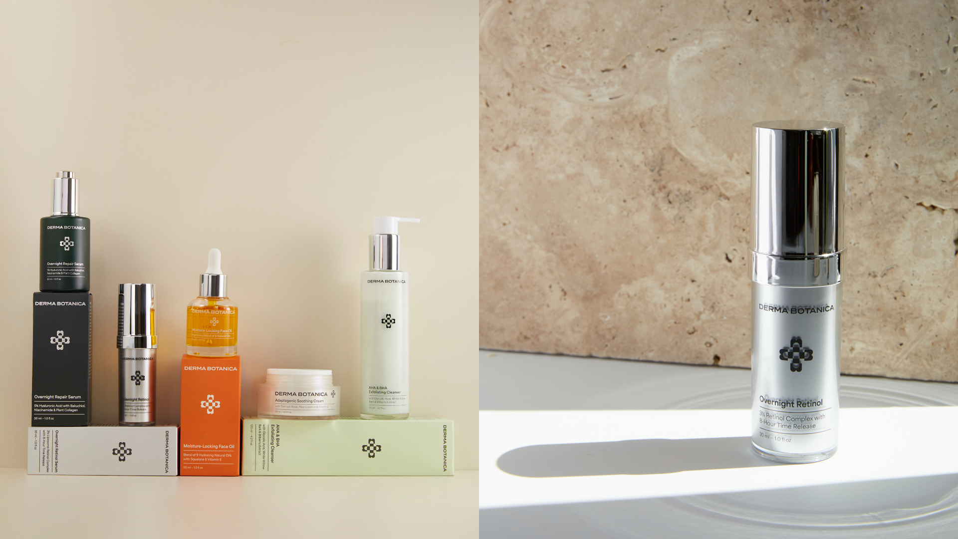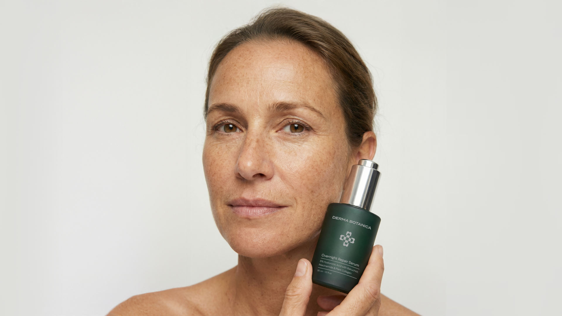
Derma Botanica is, at its core, an anti-aging skincare brand. The essence of the brand lies in its name: Derma reflects a focus on skin and science, while Botanica highlights the naturally-derived ingredients used in the formulations. The challenge was to create a sophisticated identity that would resonate with the brand’s target audience while also conveying the brand’s unique formulation philosophy.
The symbol, a geometric flower, embodies the idea of “effective botanica,” blending nature with precision. The visual strategy follows a 60/40 principle: 60% clean, measured layouts and imagery, and 40% botanical references and natural color palette.
Result
Derma Botanica generated $3M in revenue within its first three months after launch.
Client
Derma Botanica
Authors
Strategy, Art Direction and Graphic Design:
Hanna Piatrusha